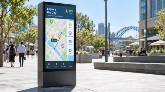
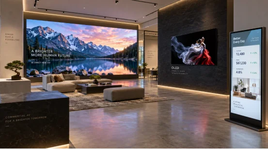
A screen might look great in a store. However, it can easily fail in a real shop window. Bright lights wash out dark spots, and brand colors can change between screens. Words that looked clear close up get hard to read from far away. That is why commercial display brightness, commercial display contrast ratio, and commercial display color gamut are vital.
You must check these specs before approving any project. Brightness helps you see the image clearly. Contrast adds visual depth. Color gamut controls the actual colors shown. You also need to think about room light, viewing distance, content type, and power use.
What Is Commercial Display Brightness?
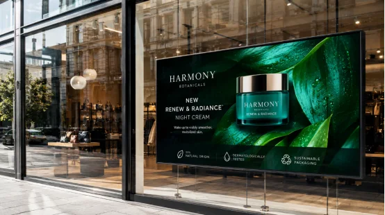
Commercial display brightness is the light a screen makes. Makers call this luminance in nits or cd/m². Brightness in nits gives you a basic starting point, but it is not the whole truth. A dark room needs one thing, while a glass window needs another. Sun and glare can make a screen look very dark.
How Is Display Brightness Measured?
Pay attention to typical brightness and peak brightness. Typical brightness offers a constant, everyday light. Peak brightness brings quick flashes of intense light, mostly for HDR. Indoor commercial displays work well with 300 to 500 nits. Sunny shops need 500 to 700 nits. Window-facing digital signage setups require 1,000 nits. Finally, outdoor display brightness easily hits 2,500 nits.
How Does Ambient Light Affect Display Brightness?
Nearby lights reflect off the glass. That harsh glare turns dark shadows gray. A high brightness commercial display solves this issue. Anti-glare glass helps too. Also, auto brightness control tweaks the panel constantly. It dims the monitor at night. Then, it boosts the glow during sunny hours to save electricity.
Why Does Commercial Display Brightness Matter?
Shoppers ignore dim screens. Images feel lifeless. Ads simply vanish. We notice this mistake constantly in retail digital signage and shop window display projects. However, an overly bright monitor strains your eyes. It also burns extra energy and runs noticeably hot.
What Is Commercial Display Contrast Ratio?
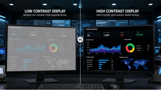
Commercial display contrast ratio is the gap between the brightest white and darkest black. A bigger gap means deeper blacks and much better shadows.
What Is Static Contrast Ratio?
Static contrast ratio shows the panel’s true power. Numbers like 1,000:1 or 3,000:1 are great for comparing screens. Static contrast is key for control room display projects and playing dark videos.
What Is Dynamic Contrast Ratio?
Dynamic contrast ratio changes the backlight based on the video. The screen dims for dark scenes and gets brighter for light ones. But dynamic contrast is just a software trick. Do not use it to replace native contrast data.
What Is Local Dimming Contrast?
Full-array local dimming uses many small backlights. Mini LED commercial display setups have many dimming zones to boost HDR peak brightness. However, you might notice display blooming. This is where bright objects get a weird glow around them.
Why Does Contrast Ratio Matter in Commercial Displays?
Commercial display contrast ratio helps you read words against a busy background. In a bright room, heavy glare makes a good screen look cheap. A basic office screen works fine with okay contrast. But a commercial video wall needs strong blacks.
What Is Commercial Display Color Gamut?
Commercial display color gamut is the mix of colors a screen shows. A wide color gamut display has richer reds, greens, and blues. Gamuts include sRGB, DCI-P3, Adobe RGB, Rec. 709, Rec. 2020, or NTSC. Gamut is different from display color accuracy.
Which Color Gamut Standards Matter?
sRGB color gamut: Works well for web pages.
Rec. 709: Standard for normal TV.
DCI-P3 color gamut: Great for movies and HDR.
Adobe RGB color gamut: Helps with photo design.
Rec. 2020: Used for huge HDR color spaces.
Always check if a spec means true coverage. A screen covering 95% of DCI-P3 might act weird at different brightness levels.
What Is Display Color Accuracy?
Display color accuracy relies on Delta E color accuracy, display white point, display gamma, and clear calibration. Hardware color calibration gives you total control. For a commercial video wall, display color uniformity matters the most.
Why Does Color Gamut Matter in Commercial Projects?
Good colors help stores show products right. Museums and hotels need true colors without weird shifts. A wide color gamut display makes ads pop. If screens have different settings, brand logos will look wrong.
How Do Brightness, Contrast Ratio, and Color Gamut Work Together?
Brightness lets you see the picture. Contrast splits light from dark. Color gamut provides the colors. Commercial display calibration ties them all together. Good HDR commercial display projects need real HDR peak brightness, strong local dimming, HDR color gamut, 10-bit color depth, and true HDR video files.
How Should You Choose a Commercial Display for Different Applications?
Retail digital signage needs 500 to 700 nits and auto brightness control. Window-facing displays need 1,000 nits. A control room display needs steady light and 24/7 commercial display support. Meeting room displays need clear text. Outdoor digital signage needs high light, cooling fans, and a safe commercial display duty cycle.
What Should You Check Before Installation?
Test screens with your real videos and actual room lights. Check the blacks, color gamut coverage, and Delta E color accuracy. Look at viewing angles, power use, commercial display operating hours, commercial display warranty, and remote tools. A short demo video is never enough.
How Can a Display Supplier Support Your Project?
Picking specs is easy when suppliers handle the hardware. YIAISIGN has over 15 years of display making skills. They have four plant lines and make up to 3,000 units a day.
They build digital signage, advertising machines, Android all-in-one machines, portable monitors, digital art frames, and smart display products. They help with proper testing and custom shipping.
FAQ
Q1: What Brightness Level Is Suitable for a Commercial Display?
A: Indoor projects use 300 to 700 nits. Window spots need 1,000 to 2,500 nits.
Q2: Is a Higher Contrast Ratio Always Better?
A: High contrast improves black levels. But the real look depends on room light and the video itself.
Q3: Is a Wider Color Gamut Always Better?
A: A wider gamut gives more colors. But you still need good tuning to make them look right.
Q4: What Is the Difference Between sRGB and DCI-P3?
A: The sRGB space is for web work. DCI-P3 is much better for HDR and high-end ads.
Q5: Does HDR Guarantee Better Commercial Display Image Quality?
A: No. Great HDR needs high peak brightness, strong black control, local dimming, wide color gamut, and the right video files.